Create and Grow
By touching upon the boundary between materiality and non-materiality I dive within the field of language communication
and interaction. My practice aims to put down on the table unconscious mental limitations to create space
and promote self-observation.
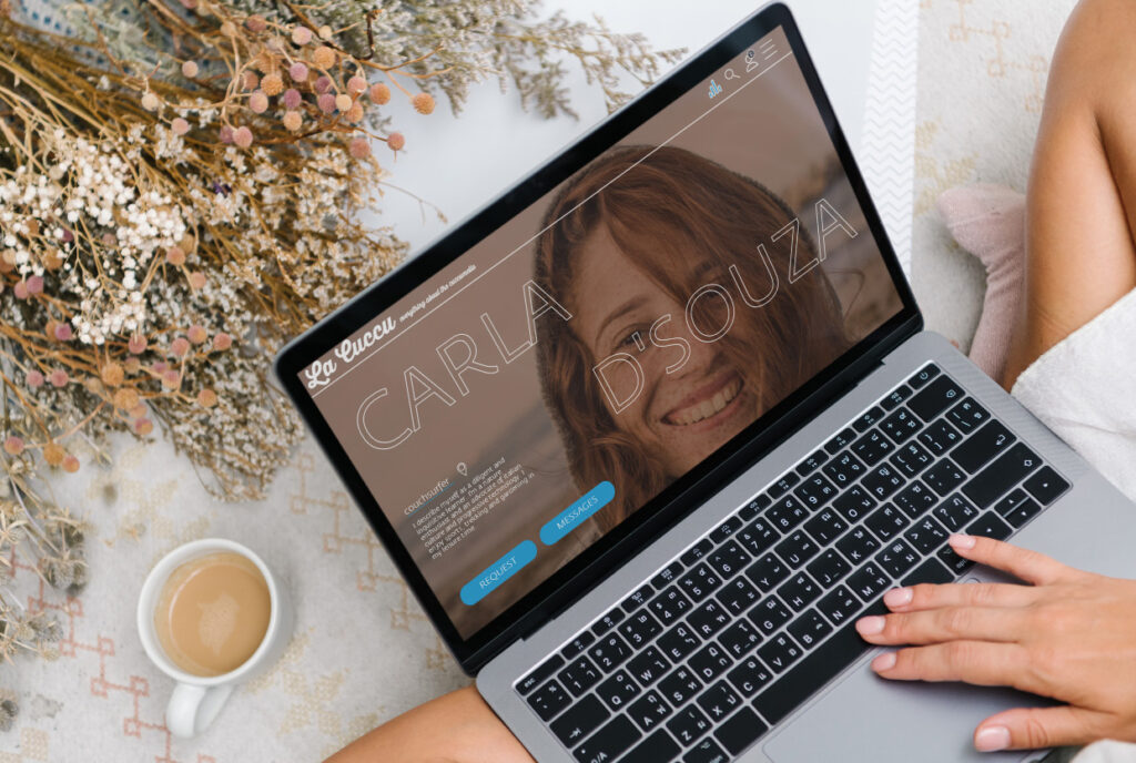
La Cuccu
La Cuccu is a space for community and friendship where people can foster and share their mutual love for Italy and coffee, in particular for the cuccumella. The site includes voiceovers so that visually-impaired members of the community are not prone to feeling at a disadvantage, and are able to benefit just as much as anyone else from the content on offer. This concept of overall inclusion is fundamental and paramount
for the ultimate purpose of our website. Beneath this, as a secondary but still highly important priority, was our attempt to replicate the mood and atmosphere of an Italian bar, which we did through the use of
colours and background music. In essence, we endeavoured to create a space in which everyone feels comfortable and happy.
Blank spaces
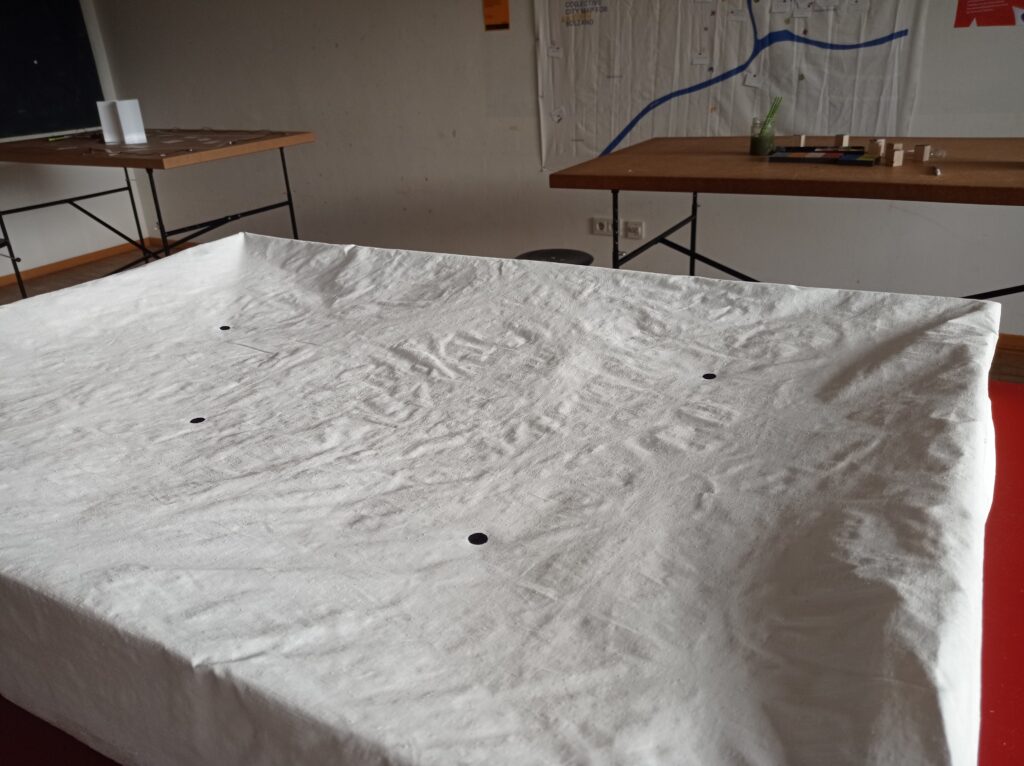
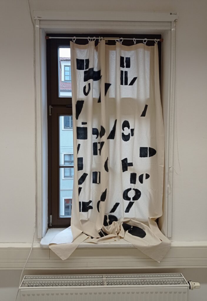
Ambience is an artistic response to a typographical layout analysis that developed throughout the semester. The work is composed of a two metre long per one metre forty wide coarse hanging cloth partially covered by black spray-painted typographical weight blocks. A curtain which separates the inside from the outside of a living block to create a paradox of language.
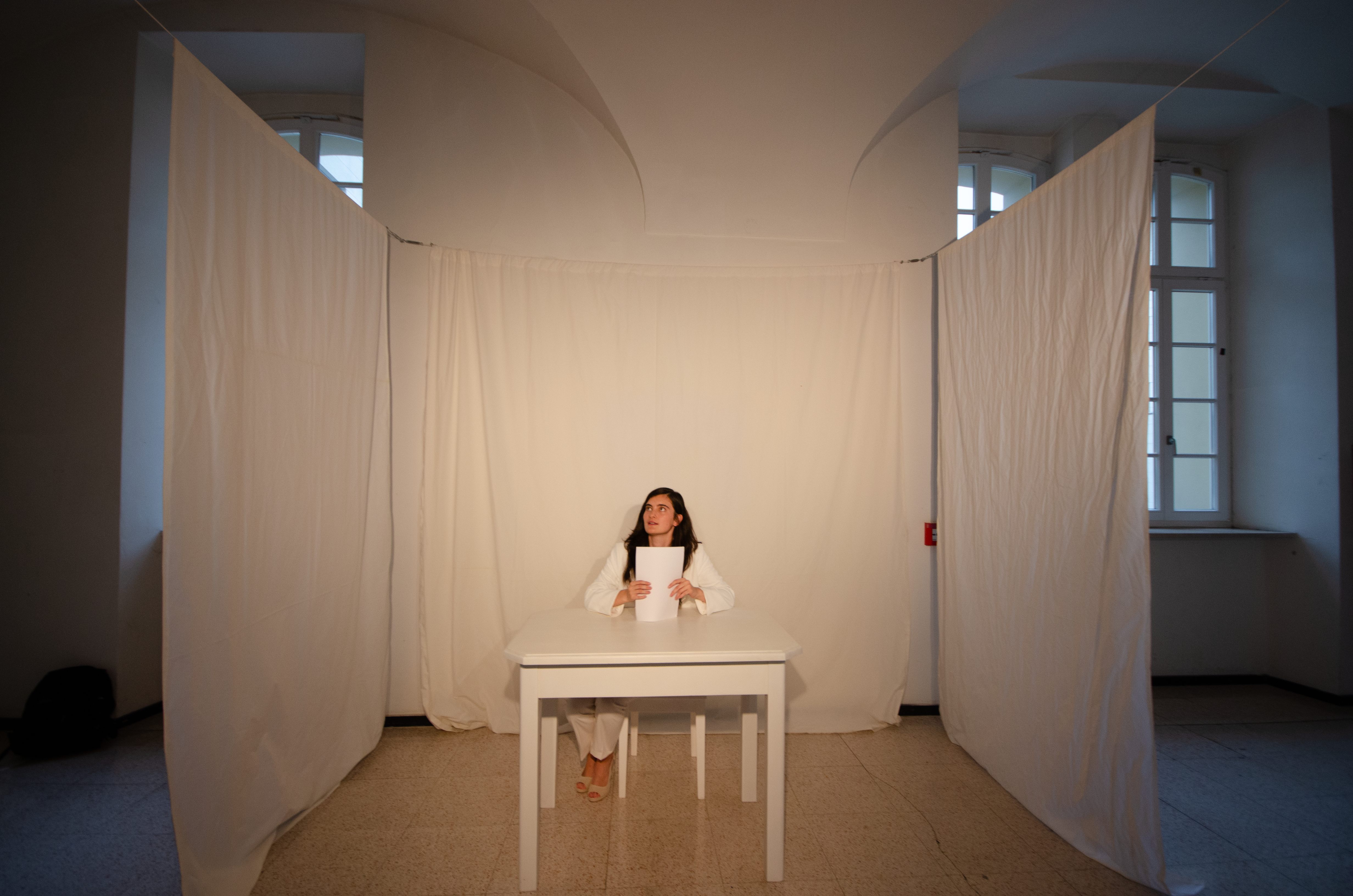
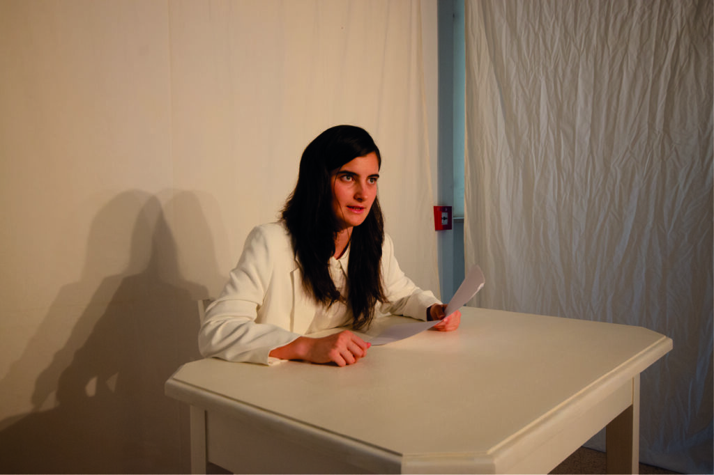
Speaking without words
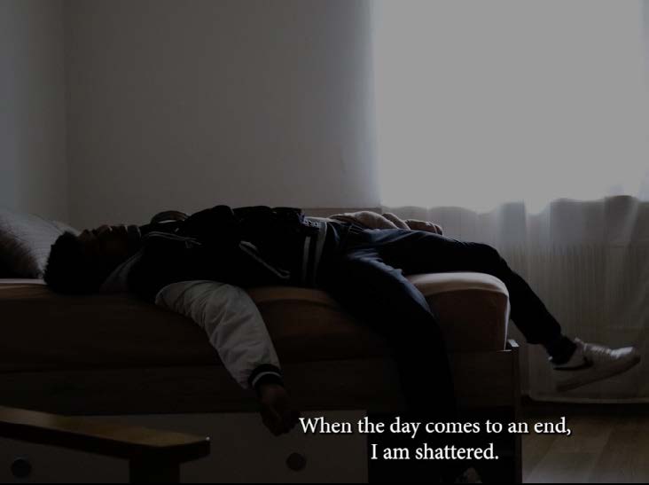
My thesis project consists of a ten-minute-long performance during which, I impersonate a formal figure, while holding a speech comprised solely of filler words. During the performance, the figure stands against a white setting, creating an ironic contrast that reflects the complexity and ambiguity of this set of every-day words. Resulting from the exploration of the place of fillers in verbal communication, this performance centres particularly on how this category of words conveys culturally and linguistically specific mental states.
Ambience
Ambience is an artistic response to a typographical layout analysis that developed throughout the semester. The work is composed of a two metre long per one metre forty wide coarse hanging cloth
partially covered by black spray-painted typographical weight blocks. A curtain which separates the inside from the outside of a living block to create a paradox of language.
Oltre le Righe
Oltre le righe is a short documentary film. Paul, a young rapper, determined to prove what he is capable of, shows up through rhymes and thoughts, battling both against inner obstacles and the challenging world of music.
Bring it Down – 105 New Things
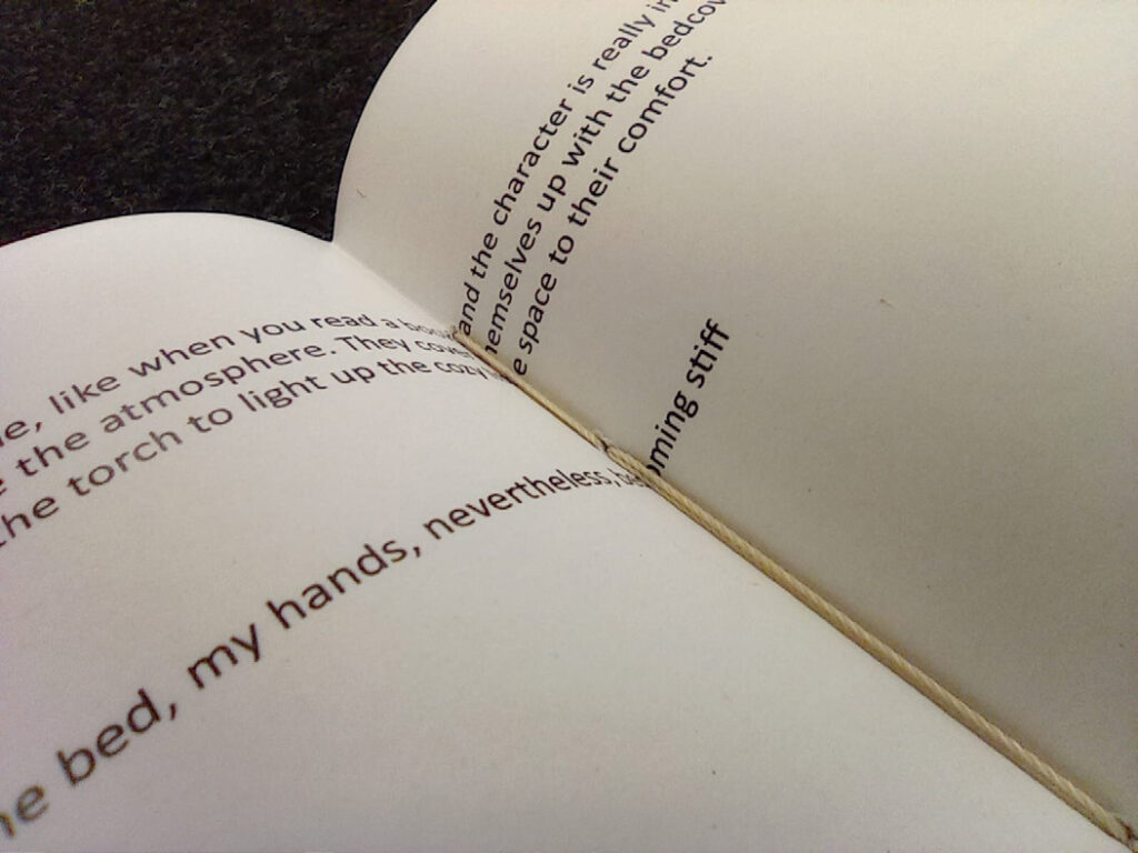
Is a printed copy of a reflective diary as an exploration of the discernment of social interactions and self perception. Depicting how doing things that are not “normal” feel by delving into the expressive capacity of language and space.
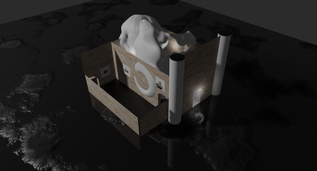
What are you hiding
This project was developed in Blender. It sprouted from a work by Beniamino Servino – an architect and designer – to explore the possibilities and boundaries of creating a digital space by lingering on the meaning of “classical” architecture in dialogue with “blobitecture”.
By intertwining both the “edgy”, box-like, internationalized style, and “soft-edged” architecture, I gave a go at pushing and testing the limits of the program, questioning whether they could both coexist together in a harmonious way in the realms of the digital space.
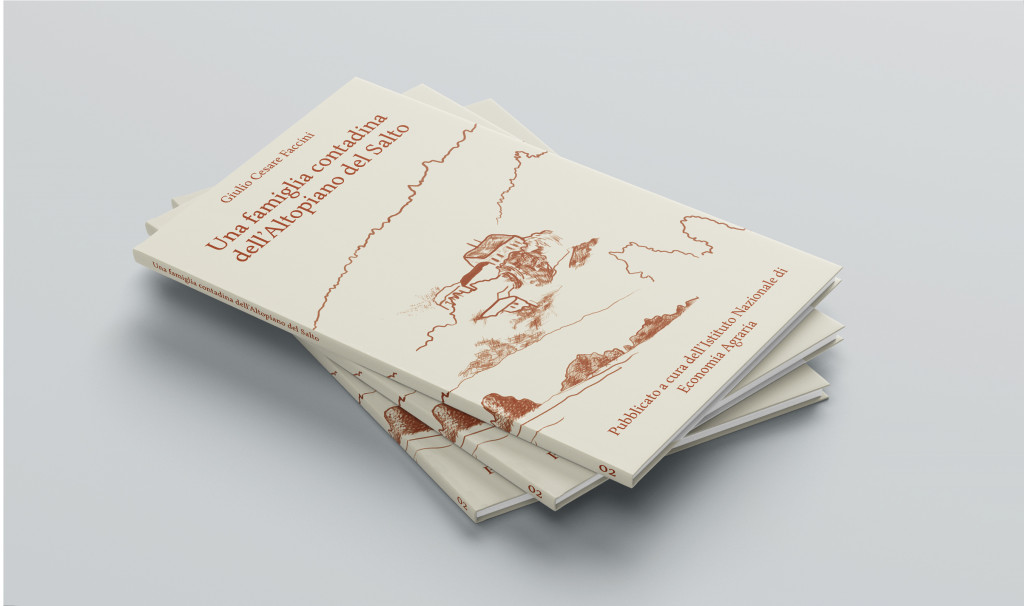
Una famiglia contadina dell’Altopiano del Salto
The theme explored for this project is that of a farmer family based in 1939, Meltina, Alto Adige. The text set in an “old novel style”, which details daily life in this region almost a 100 years ago, caught our eye. To follow the line of “the classical book”, and wishing to represent the essence of the tome itself as well as the time it was set in, a one column layout proved to be the finest choice. Simple though concise, yet giving it a twist by skipping the constraints of the margins when placing the illustrations, which in their turn, evoke, together with the types of paper and font used for the inside pages and cover, a sense of old, wood-crafted farmer style.
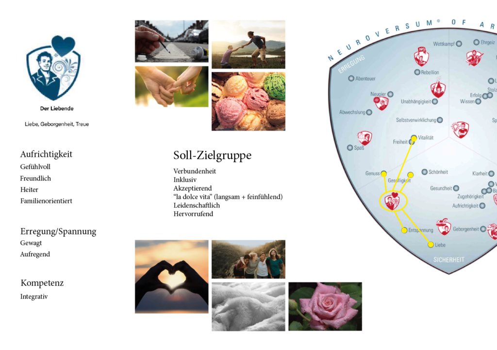
Brand repositioning
This project was a detailed analysis of a hypothetical brand repositioning. By studying the values, archetype, personality and current target group of the music brand Energy Sistem and comparing it with Sony I aimed at bringing the initial Lover archetype back to live by redirecting the target group, creating a brand story and idiating four steps to implement brand communication in a multisensory way.
Tensions
Living the tensions I projected my world. Onto the outside of a circularity.
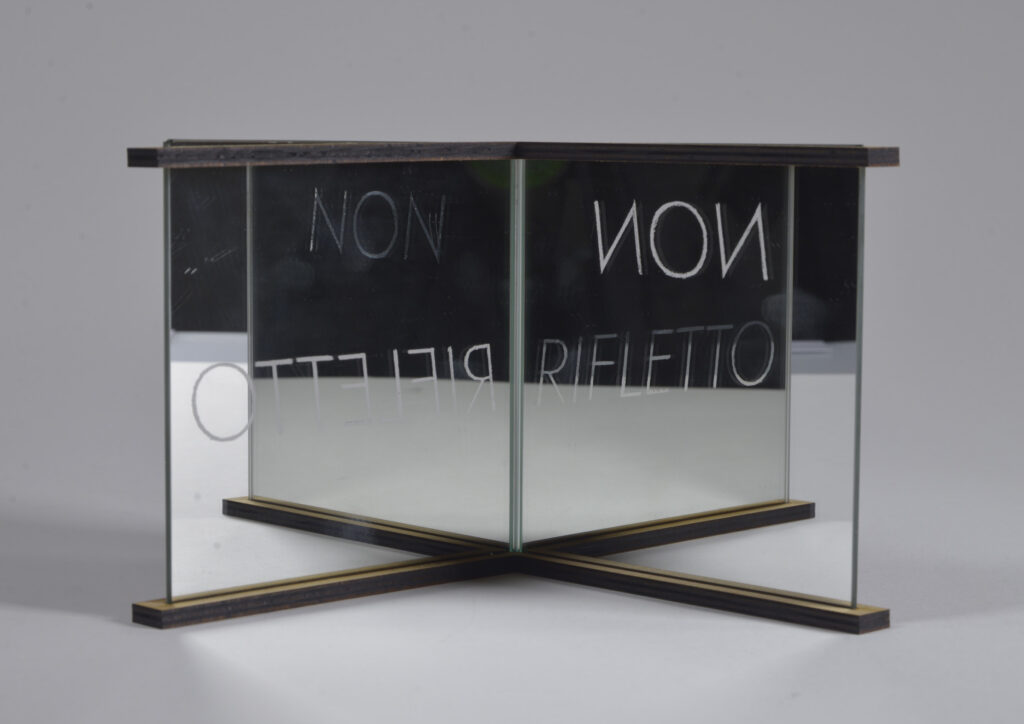
NON RIFLETTO
Shining light upon a paradigm of reflection and an infused statement.
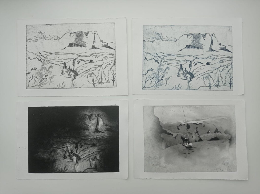
Land scape
“Land scape” is a collection of prints out of zinc plate etching and aquatint that tests the etched surfaces’ threshold by means of colour, bringing out lightness and darkness. The perceptible and the intangible in a prevailing landscape and a fleeting moment.
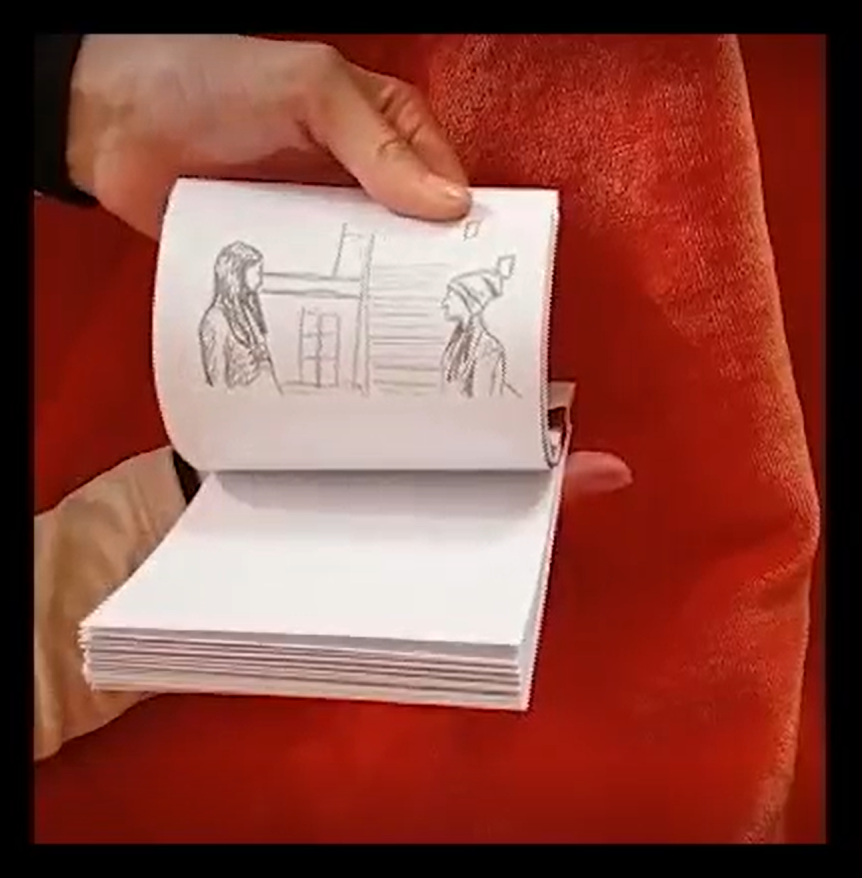
Dual
This project consisted on an hand-drawn animation booklet portraying a significant moment in the main character’s life.
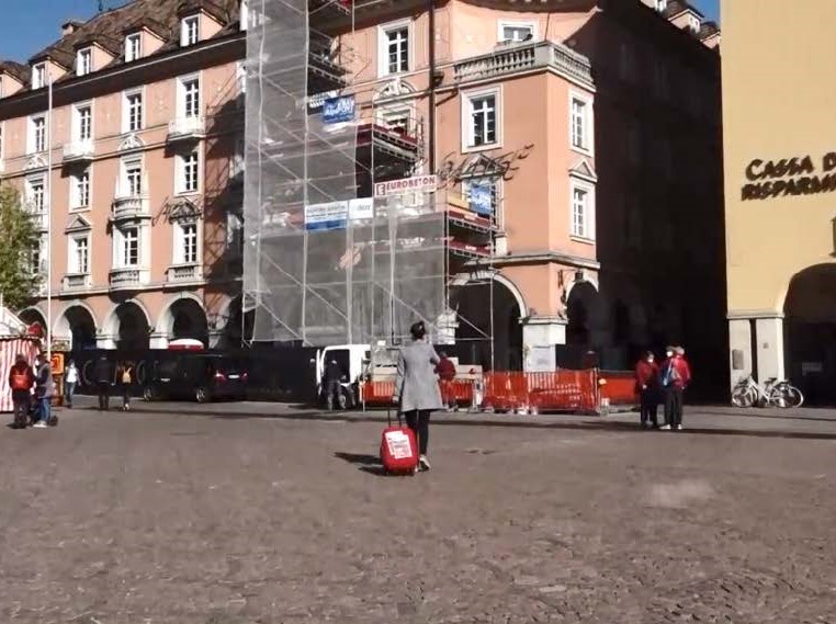
Exposing my Secret
Having brought a stack of packets of high quality Spanish ham back to Italy after Easter, I walked along the streets of Bolzano talking loudly in Spanish on the phone, while dragging a roller suitcase I used to travel, with two colour photocopies of one of the ham packets I had stored in my room, stuck to it.
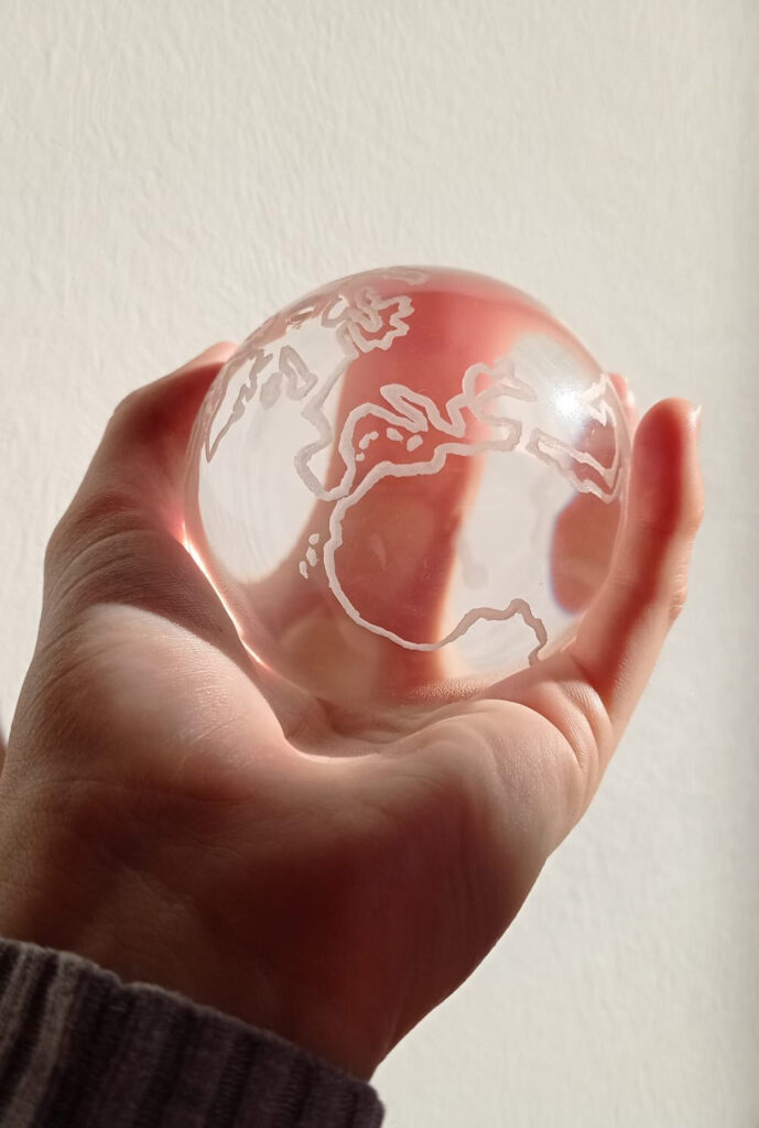
Nature Connect
Exercise intended to observe human and technological resemblance,
in connection with nature/mother earth.
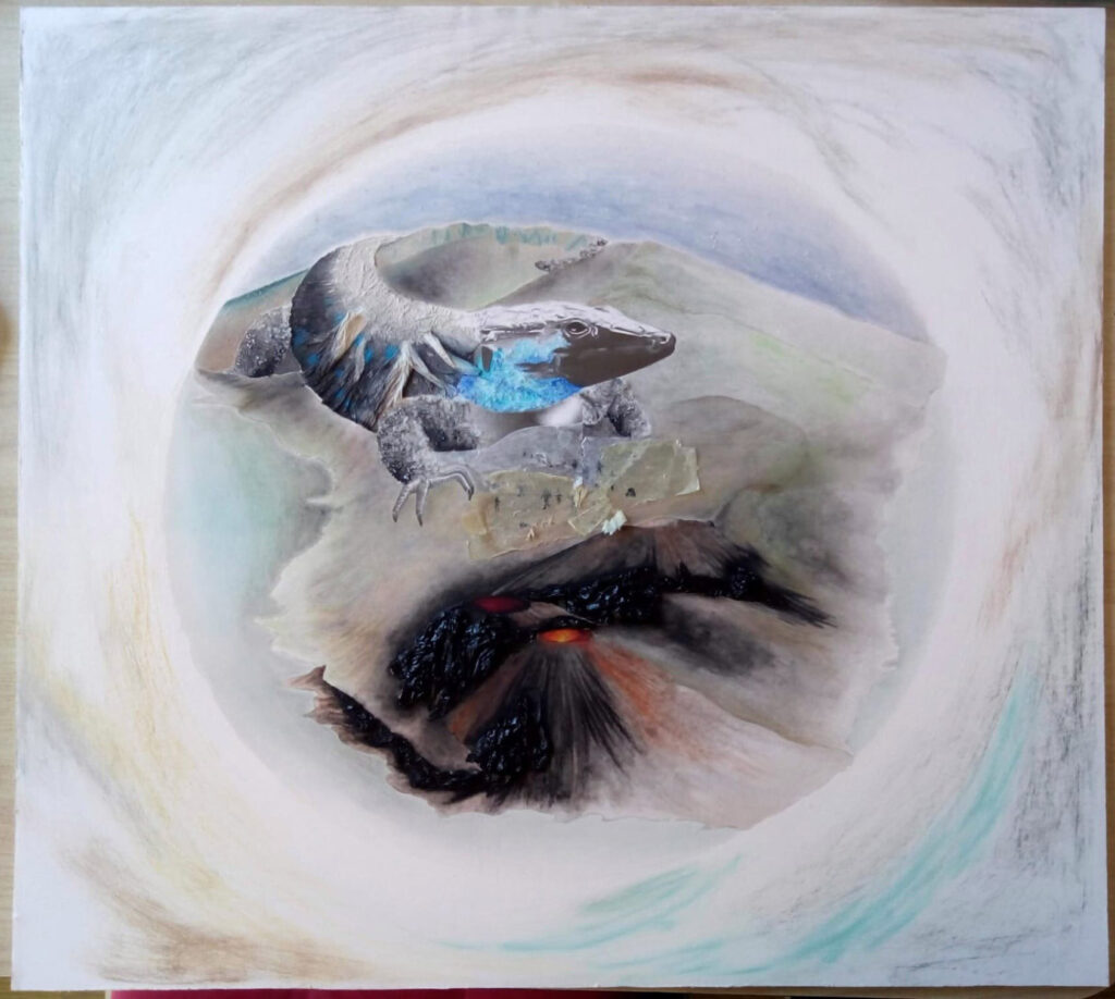
The Beautiful Island
The final piece of the project “The beautiful island” requests to return
the attention to the significance of the nature present in the island of La Palma, in the Canary islands. The process book is an ongoing analysis
of artists’ works, the expressivity of varying techniques and materials, and the biological, ecological and endemic aspects regarding the island.
All this leads to the final piece.